Exploratory Data Analysis with Fitbit Data
I thought it would be awesome to analyze my own data, therefore in June 2019, I started tracking activities with Fitbit. Fitbit isn’t a perfect measure of activities, but it can provide an overall idea of how active you are and how you sleep.
In this post, we are going to take activities and sleep data collected for over a year and perform Exploratory Data Analysis(EDA) to find some fun and interesting insights. We will spend exploration mostly on the steps. Additionally, we will see if activities are correlated. Let’s analyze them together.
First, we start by loading required libraries, and then follow EDA steps below.
library(pacman)
p_load(tidyverse,ggpubr,xts,dygraphs,corrplot,dlookr,ggcorrplot)
1. Get the data
Data was exported directly. Fitbit data can also be accessed via API method.
fitbit_data <- read_csv('fitbit.csv')2. Cleaning the data
Variables are self explanatory. Some variables are not in correct format, so we need to change them.
#Change variables type
fitbit_data$Date <- as.Date(fitbit_data$Date, format = "%m/%d/%Y")
fitbit_data$Month <- factor(fitbit_data$Month)
fitbit_data$Minutes_REM_Sleep <- as.integer(fitbit_data$Minutes_REM_Sleep)
fitbit_data$Minutes_Light_Sleep <- as.integer(fitbit_data$Minutes_Light_Sleep)
fitbit_data$Minutes_Deep_Sleep <- as.integer(fitbit_data$Minutes_Deep_Sleep)
fitbit_data$Day <- as.factor(fitbit_data$Day)
Since we have enough data points, let’s remove NA values for accurate representation. Additionally, we create a variable “Minutes_Active” using dpylr mutate() function.
fitbit_data1 <- na.omit(fitbit_data) # remove na's
# add a column Minutes_Active
fitbit_data1 <- fitbit_data1 %>% mutate(Minutes_Active = (Minutes_Fairly_Active+Minutes_Lightly_Active+Minutes_Very_Active))
head(fitbit_data1)
## # A tibble: 6 x 18
## Date Month Day Calories_Burned Steps Minutes_Sedenta… Minutes_Lightly…
## <date> <fct> <fct> <dbl> <dbl> <dbl> <dbl>
## 1 2019-06-11 Jun Tue 2867 11699 847 170
## 2 2019-06-13 Jun Thu 2687 8087 842 205
## 3 2019-06-15 Jun Sat 3226 13815 699 272
## 4 2019-06-17 Jun Mon 2895 11348 845 192
## 5 2019-06-18 Jun Tue 2620 11116 825 106
## 6 2019-06-20 Jun Thu 2812 12032 954 135
## # … with 11 more variables: Minutes_Fairly_Active <dbl>,
## # Minutes_Very_Active <dbl>, Activity_Calories <dbl>, Minutes_Asleep <dbl>,
## # Minutes_Awake <dbl>, Number_Awakenings <dbl>, Time_In_Bed <dbl>,
## # Minutes_REM_Sleep <int>, Minutes_Light_Sleep <int>,
## # Minutes_Deep_Sleep <int>, Minutes_Active <dbl>3. Data Analysis
3.1 Steps
For steps analysis, we will use original data since there are not missing steps.
How many steps did I take in 392 days?
summarise(fitbit_data,Total_Steps = sum(Steps))## # A tibble: 1 x 1
## Total_Steps
## <dbl>
## 1 36570843.6 million steps!
On average, I walk or run a mile in about 2,000 steps; therefore total distance traveled by feet in 56 weeks is 1829 miles.
summarise(fitbit_data,Miles = sum(Steps)/2000)## # A tibble: 1 x 1
## Miles
## <dbl>
## 1 1829.Let’s plot line chart to see distribution of steps.
fitbit_data  %>% ggplot( aes(x=Date, y= Steps)) +
    geom_line( color="red")  + scale_x_date(date_labels = "%b\n%Y", date_breaks = "1 month", limits = c(as.Date("2019-06-01"),as.Date("2020-07-04")))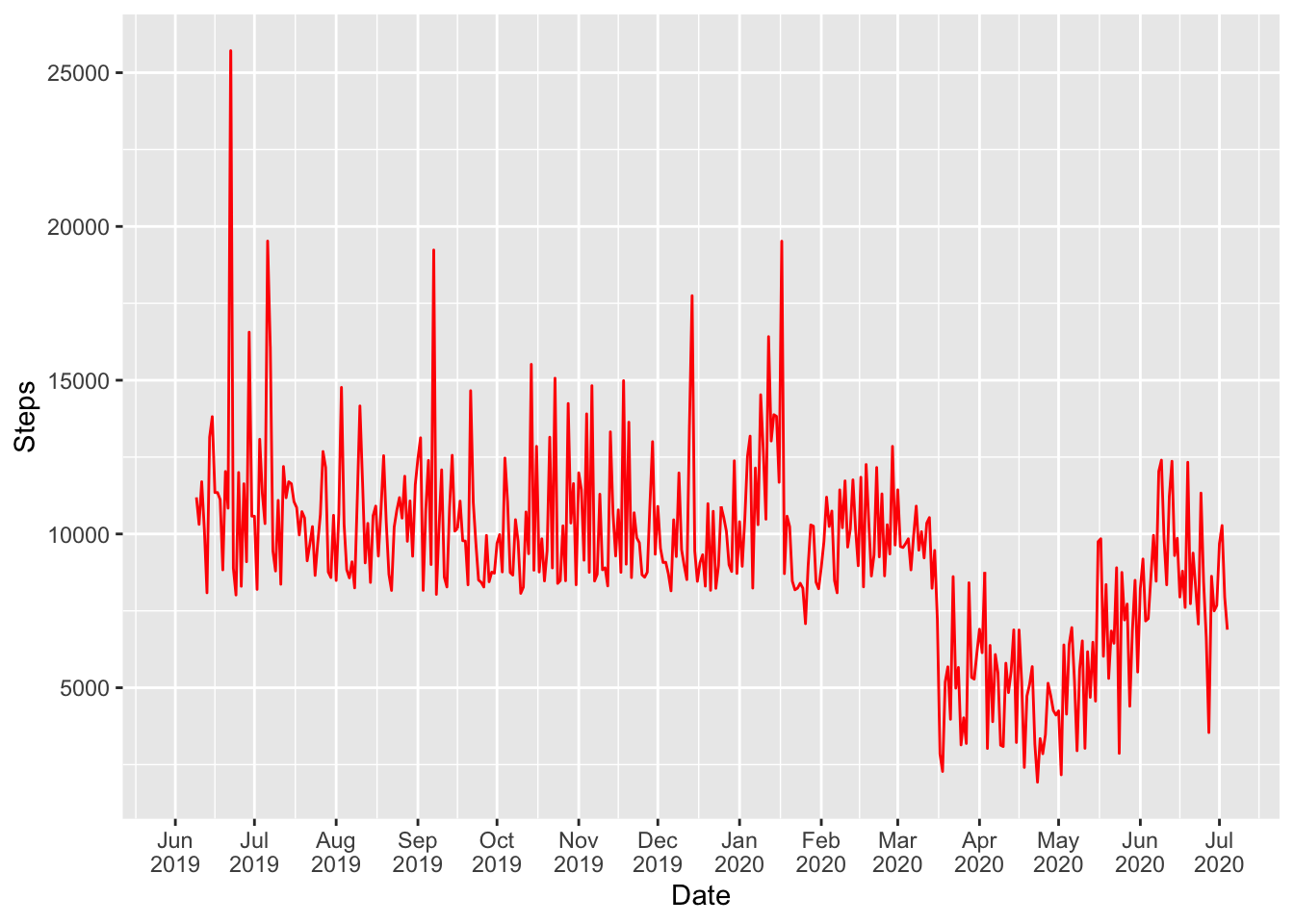
My daily steps goal is 8,000. I never missed the goal until Jan 26, 2020 - the day I didn’t reach target to honor tragic loss of NBA legend Kobe Bryant, Rest in Peace!
Daily average steps were about 10,000 per day until Feb 2020. What happened March through June?
I am sure you guessed it right. Like most people I was under shelter-in-place due to COVID-19. I started to hit my goal again as restrictions were being lifted in June.
How are steps distributed?
fitbit_data %>% select(Steps) %>% plot_normality() 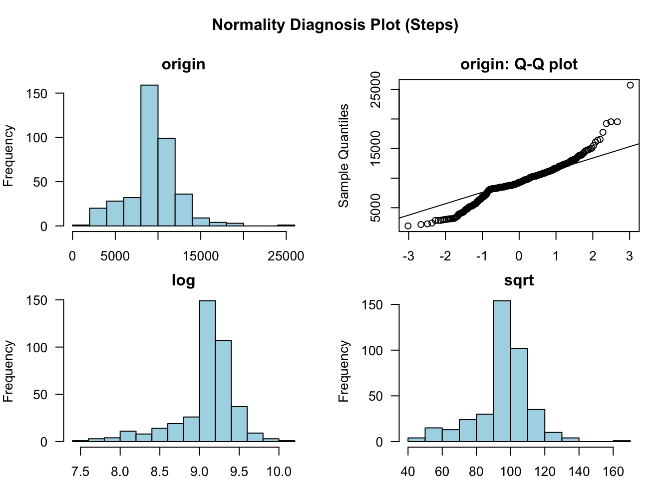
Steps are approximately normally distributed. It is further illustrated visually by violin plot.
#Violin Plot
ggplot(fitbit_data, aes(x = Date, y = Steps)) + geom_violin(fill = 'green', alpha= 0.5, position = 'dodge') + xlab("Month") + ylab("No. of Steps") 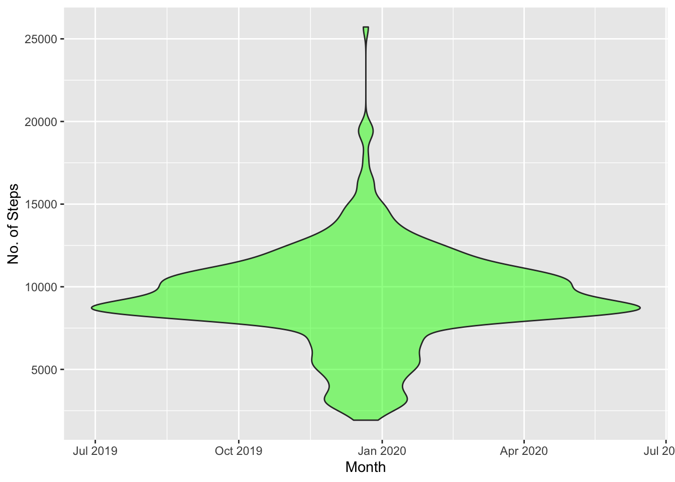
Let’s explore steps weekly and then monthly.
ggplot(fitbit_data, mapping = aes(x= reorder(Day,Steps, FUN = mean ),y = Steps)) + geom_boxplot() 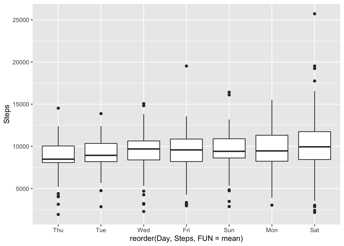
I am impressed with my performance on Mondays - pretty consistent and second best average steps.
# monthly
ggplot(fitbit_data, mapping = aes(x= reorder(Month,Steps, FUN = median ),y = Steps)) + geom_boxplot() 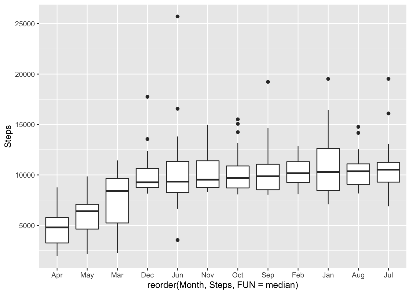
Winter is rainy in the Bay Area; it has negative impact on the movement.
3.2 All Variables
Let’s explore all activities.
p1 <- fitbit_data1 %>% group_by(Day) %>% describe(Minutes_Active) %>% select(variable, Day, mean) %>% ggplot(aes(x=reorder(Day, -mean), y=mean)) + geom_bar(stat="identity", fill="steelblue")+ xlab("Day") + ylab(" Minutes Active") + theme_minimal()

p2<- fitbit_data1 %>% group_by(Day) %>% describe(Minutes_Asleep) %>% select(variable, Day, mean) %>% ggplot(aes(x=reorder(Day, -mean), y=mean)) + geom_bar(stat="identity", fill="steelblue")+ xlab("Day") + ylab(" Minutes Asleep") + theme_minimal()

p3<- fitbit_data1 %>% group_by(Day) %>% describe(Minutes_Sedentary) %>% select(variable, Day, mean) %>% ggplot(aes(x=reorder(Day, -mean), y=mean)) + geom_bar(stat="identity", fill="steelblue")+ xlab("Day") + ylab(" Minutes Sedentary") + theme_minimal()

p4<- fitbit_data1 %>% group_by(Day) %>% describe(Steps) %>% select(variable, Day, mean) %>% ggplot(aes(x=reorder(Day, -mean), y=mean)) + geom_bar(stat="identity", fill="steelblue")+ xlab("Day") + ylab(" Steps") + theme_minimal()

# plot side by side
ggarrange(p1,p2,p3,p4) 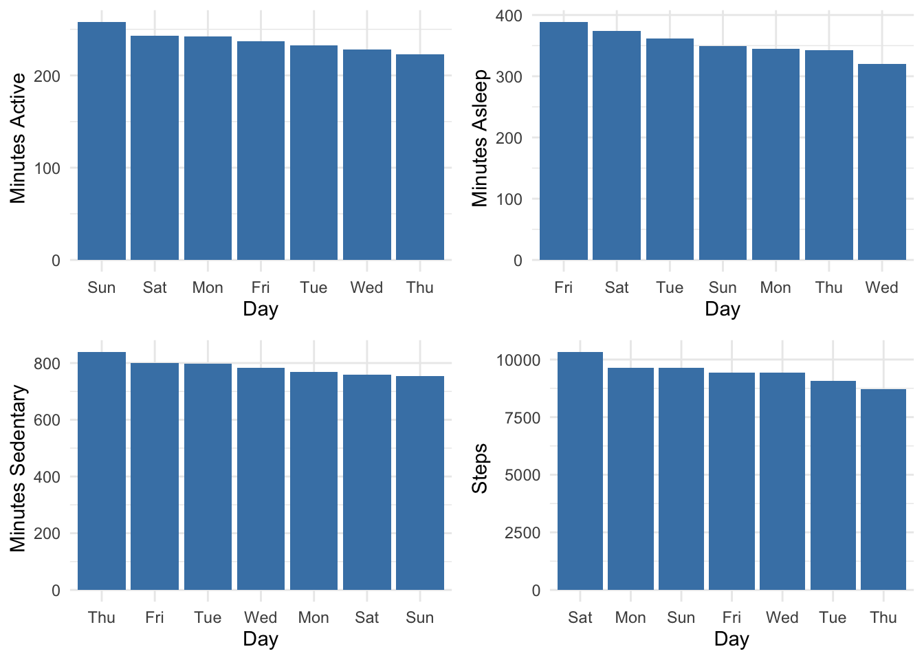
Fridays are pretty erratic. I move and sleep more over the weekend.
How do I spend my days?
fitbit_data1 %>% describe(Minutes_Sedentary,Minutes_Active,Time_In_Bed) %>% select(variable, mean) %>% ggplot(aes(x=reorder(variable, mean), y=mean)) + geom_bar(stat="identity", fill="steelblue", width = 0.5)+ xlab("Activities") + ylab(" Minutes ") + theme_minimal() 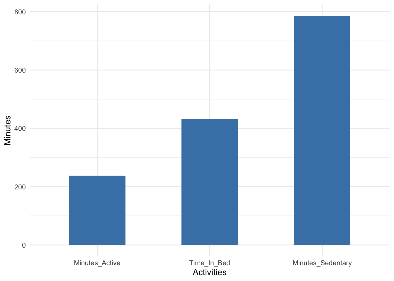
That’s a lot of sedentary minutes. I would love to bring those minutes down a bit.
Let’s breakdown sleep cycles and calculate minutes spent in each stage.
# pie chart
p5<- fitbit_data1 %>% describe(Minutes_Awake,Minutes_REM_Sleep,Minutes_Light_Sleep,Minutes_Deep_Sleep) %>% select(variable, mean)
pie <- ggplot(p5, aes(x = "", y=mean, fill = factor(variable)))+ geom_bar(width = 1, stat = "identity") + geom_text(aes(label = paste(round(mean/sum(mean)*100), "%")), position = position_stack(vjust = 0.5)) + theme_classic() +
 theme(plot.title = element_text(hjust = 0.5),
       axis.line = element_blank(),
       axis.text = element_blank(),
       axis.ticks = element_blank()) +
  labs(fill= "Sleep Stages", x = NULL, y = NULL)
pie + coord_polar("y")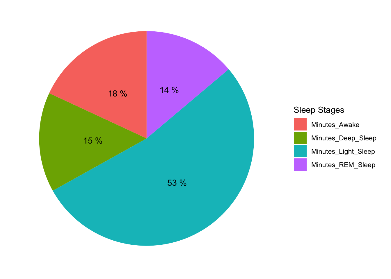
Minutes Awakes are high. It is contributed largely by my reluctance to leave bed when alarm goes off in the morning.
Next, we compute the statistics with all variables numerically and graphically.
fitbit_data1 %>% describe() %>% select(variable, mean,sd, p00,p50, p100)## # A tibble: 15 x 6
## variable mean sd p00 p50 p100
## <chr> <dbl> <dbl> <dbl> <dbl> <dbl>
## 1 Calories_Burned 2662. 235. 2046 2651 3661
## 2 Steps 9462. 2878. 1928 9446. 19525
## 3 Minutes_Sedentary 786. 129. 445 774 1401
## 4 Minutes_Lightly_Active 191. 44.1 39 191 385
## 5 Minutes_Fairly_Active 14.8 11.4 0 13 69
## 6 Minutes_Very_Active 31.6 19.7 0 30 111
## 7 Activity_Calories 1125. 294. 131 1127 2406
## 8 Minutes_Asleep 355. 54.7 152 354. 529
## 9 Minutes_Awake 78.2 17.2 36 77.5 143
## 10 Number_Awakenings 32.9 8.23 13 33 60
## 11 Time_In_Bed 433. 66.6 188 431 654
## 12 Minutes_REM_Sleep 59.9 25.1 4 58 129
## 13 Minutes_Light_Sleep 230. 42.1 106 230 386
## 14 Minutes_Deep_Sleep 65.0 18.5 7 66 114
## 15 Minutes_Active 238. 51.3 39 238 440p00 is minimum, p50 is median and p100 is max value.
# bar plot with avg of all variables
fitbit_data1 %>% describe() %>% select(variable, mean) %>% ggplot(aes(x=reorder(variable, mean), y=mean)) + geom_bar(stat="identity", fill="steelblue")+ xlab("Activities") + ylab("Counts ") + theme_minimal() + coord_flip()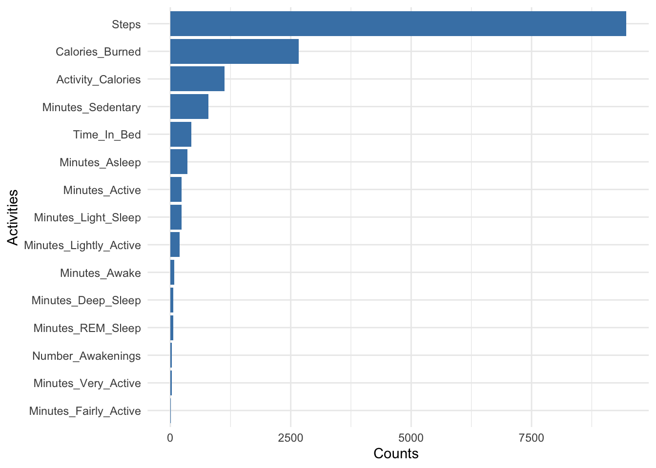
3.3 Time Series Plot
Let’s plot variables with interactive time series plot to see pattern over the time.
ft_timeSeries <- xts(x = select(fitbit_data,-(Date:Month)),
                                order.by = fitbit_data$Date)
dygraph(ft_timeSeries, main = "Time Series Plot")
3.4 Correlation
Finally, let’s see if variables are correlated. Note: correlation doesn’t imply causation.
fitbit_data2 <- fitbit_data1 %>% select(-Day,-Month,-Date )
ggcorrplot(cor(fitbit_data2), hc.order = TRUE)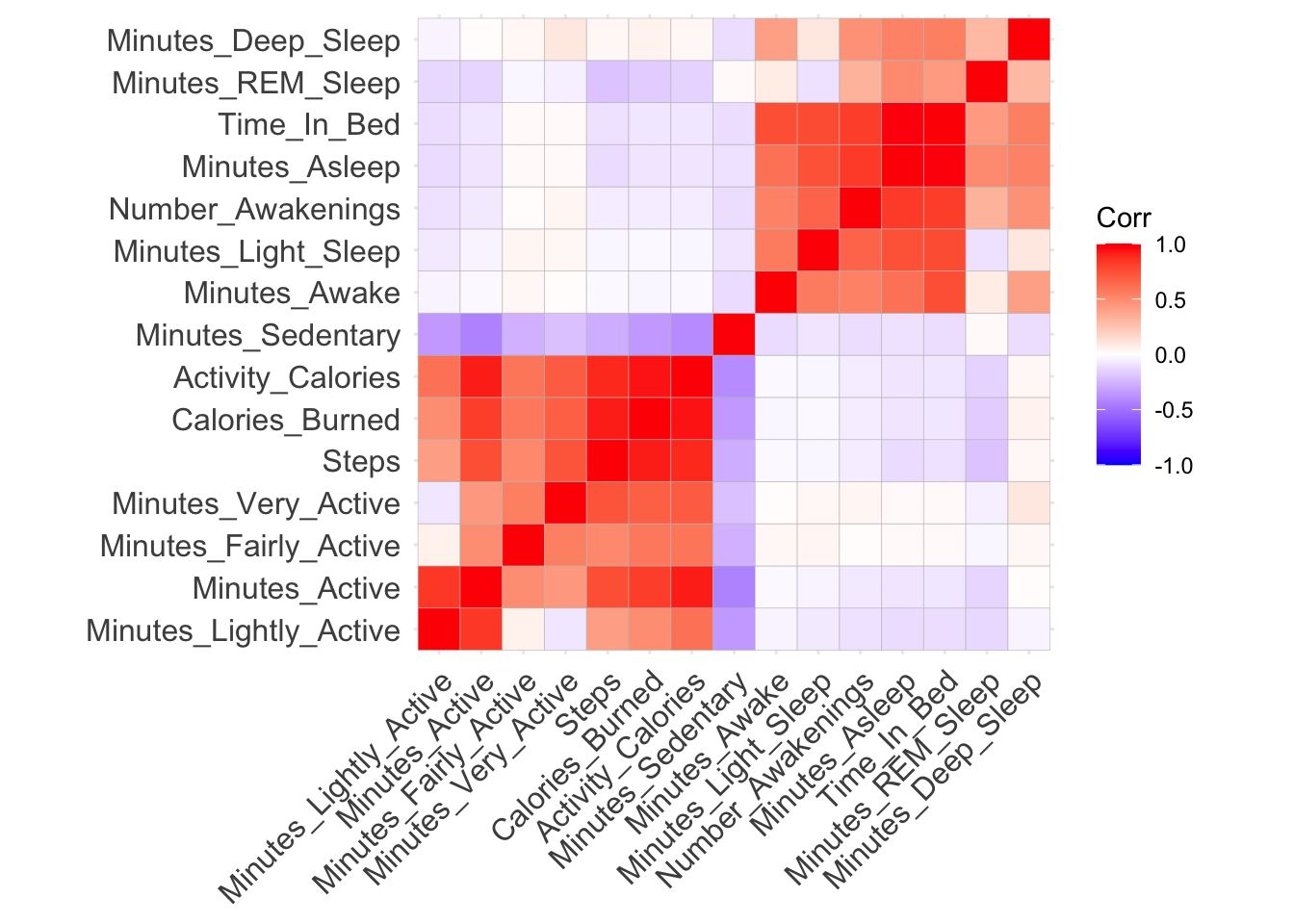
Sleeping more doesn’t necessarily guarantee good REM and deep sleep. Steps are highly correlated with calories burned.